Coopting Artisteer's button design to make your own Artisteer-like buttons
Note: I wrote this post while using version 3 of Artisteer. Since that time, Artisteer has changed the way they do buttons in version 4. I haven’t looked at it fully, but it appears they have gone from using graphics to just CSS, which is good and bad. It’s good because it’s easier to modify pure-CSS buttons for, say, color. It’s bad because we’ve lost the javascript, CSS and markup that make the technique shown here to work. If I figure out how to retrofit it onto version 4, I’ll show how in another post.
Artisteer is a great web design tool for those of us who aren’t professional front-end designers. It gives you the tools to make designs that are flexible and don’t suck without having to be a css or Photoshop expert. And you can still tweak your results from outside the tool as long as you know what you’re doing. I’ve successfully used it to put skins on CMS sites as well as wikis, statically-generated sites (like this one), you-name-it.
When it comes to using Artisteer, it has a lot of standard html elements you’d expect. Even though it’s meant primarily as a css and skinning tool, and more recently a blog content tool, recent versions include basic form elements that you can wire up once you’ve generated the html output from Artisteer. Buttons have been there from the beginning though, in the form of dressed up anchor links.
Buttons are one of the examples of things Artisteer does pretty well out of the box. They don’t submit form contents, but if you just need a button on a page that takes you somewhere else, they do a fine job. Having a good basic button that looks like one when it’s rendered, but adapts to the size of its content and presents itself uniformly across all browsers is something of a feat apparently. I’ve worked with another wildly popular css bootstrapping frameworks which shall remain nameless ;) and been disappointed to see it lose half of its charm as soon as you use IE to view the page. No “IE is so last millenium” snobbiness please, I have clients I need to serve and I don’t get to install Chrome for them. Artisteer’s buttons preserve their rounded corners all the way back to IE6, and that’s a big part of Artisteer’s charm…they’ve focused on making their content-generation up-to-date on the latest standards without sacrificing how it looks to the widest audience.
That’s not to say that everything is rosy with Artisteer all the time. If you’re a pro, you’d quickly find yourself hobbled with the interface and would find plenty to sneer at, I’m sure. I’ll be talking about how to cope with one such annoyance here.
The problem with Artisteer’s buttons is that you only get one style. The button design tool is very flexible (although not as flexible as Photoshop, of course), but once you’ve settled your design, you can’t so much as change its color without changing every button on the site. Given that buttons are an important way of communicating the range of possible actions a user can take on your site, it makes no sense to only have one kind of button.
Chucking their button design out the window poses a different challenge,
since you then have to come up with your own flexible and
platform-robust button scheme that preserves some of the nice aspects of
Artisteer’s buttons, such as the fact that any CMS user can easily make
one by just making a link with their text and adding the .art-button
class to it. Besides, their designs can come up with some pretty
attractive and modern-looking buttons. Why not keep the positive aspects
of the Artisteer button design and just change the stuff you want
control over, such as the background graphic and font properties?
Artisteer basically uses a background-sprite approach to making buttons. The button text is just the link text rendered in its own style, over a button image that Artisteer generates whenever you export to html.
The html
The html looks like this:
<span class="art-button-wrapper">
  <span class="art-button-l"></span>
  <span class="art-button-r"></span>
  <a href="#" class="art-button">Button Text</a>
</span>
That may seem like a lot for a button. The good news is that the clever folks at Artisteer have made it easier on the user than that and have included a bit of javascript which automatically converts the following html into the proper structure given above:
<a href="#" class="art-button">Button Text</a>Still, it’s necessary to look at the full structure of the html and css behind it to understand how they work.
The wrapper
Here’s the css tied to the outer wrapper:
span.art-button-wrapper
{
   vertical-align: middle;
   display: inline-block;
   position: relative;
   height: 31px;
   overflow: hidden;
   white-space: nowrap;
   text-indent: 0;
   width: auto;
   max-width:1000px;
   margin: 0;
   padding: 0;
   z-index: 0;
}

.firefox2 span.art-button-wrapper
{
   display: block;
   float: left;
}
As you can see, it mostly sets the size parameters of the button and the
display style as inline-block.
The -l and -r spans
Inside the wrapper are two spans that act as structure for the css to attach to. They show the backround bitmap for the button. Here’s the first part of their css:
span.art-button-wrapper>span.art-button-l, span.art-button-wrapper>span.art-button-r
{
   display: block;
   position: absolute;
   top: 0;
   bottom: 0;
   margin: 0;
   padding: 0;
   background-image: url('images/button.png');
   background-repeat: no-repeat;
}
This sets the display back to block, chooses the image and resets margin and padding. Here’s what the button image looks like:
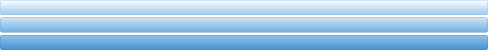
As it so happens, the image width is 1000px, exactly what the max width was set to in the wrapper css. So you can make a button as wide as 1000px and the background image will stretch to accommodate. Not that you’d want to make a button that big, but it’s good to know that you could.
There are actually three buttons here: the top is the image of the button “at rest”, the middle is the button when hovered over and the bottom is the button when it is clicked or activated.
They are of the same dimensions as each other so they appear to be the same button, just with different colors when you interact with them. In reality, Artisteer is using the background sprite technique which involves only showing a window on the background that you want to see, and instantaneously moving that window to another part of the background (one of the other colored buttons) when you interact with what you see.
So the height of each of the buttons is 31px, which was also set in the wrapper.
Because the background is a png image, it has full alpha support which allows you to round the corners however you like while the page background shows through around them.
Here’s the rest of their css:
span.art-button-wrapper>span.art-button-l
{
   left: 0;
   right: 5px;
   background-position: top left;
}

span.art-button-wrapper>span.art-button-r
{
   width: 5px;
   right: 0;
   background-position: top right;
}

span.art-button-wrapper.hover>span.art-button-l
{
   background-position: center left;
}

span.art-button-wrapper.hover>span.art-button-r
{
   background-position: center right;
}

span.art-button-wrapper.active>span.art-button-l
{
   background-position: bottom left;
}

span.art-button-wrapper.active>span.art-button-r
{
   background-position: bottom right;
}
Here you see how the position on the background image is changed based on state. The hover and active states switch to the middle and bottom of the image respectively.
Here’s where you also see how the button shows up as one piece even when shorter than 1000px (thankfully). There are really two copies of the image being shown, one on the -l span and one on the -r. The -l and -r spans show the left and right sides of the background respectively. The -l span is set to not go past 5px before its right edge. Because overflow is set to hidden, this shows the left background image but leaves a 5px gap on the right side.
The -r background image is set to only show 5px of width, giving you the completion of the button. The button then sizes itself around the content inside, which gives you a flexible width up to 1000px.
Because it’s image-based rather than css-based for the corners and colors/gradient/what-have-you, it’s widely compatible and consistent with browsers. “But IE6 doesn’t support png alpha-transparency,” you might say. Well, I’m not sure how it renders on IE6 since I don’t have a copy lying around, but I can tell you that there is button-specific css injected through an IE6 stylesheet that Artisteer provides, so I’m sure it degrades reasonably. And Firefox/Chrome/IE compatibility is better than I’ve seen elsewhere.
The big downside to this is that while the button can adapt to different widths, its height is fixed by the image. If you want a 30px button, that’s all the background image can be used for, unless you sacrifice borders, rounded corners and gradients, at which point you’d be better off with basic css. We’ll be making a button with a different height, so it’s still useful to do, but you can’t reuse it for different content heights.
The background image also has to be rectangle-based and to appear uniform in the vertical direction, since you have to be able to stitch the right 5px onto the rest of it at any horizontal point. If the rounded corners need more than 5px, you also have to adjust the gap distance to allow more of the right side.
Finally, here’s the css for what goes inside the button:
span.art-button-wrapper>a.art-button,
span.art-button-wrapper>a.art-button:link,
span.art-button-wrapper>input.art-button,
span.art-button-wrapper>button.art-button
{
   text-decoration: none;
   font-family: Georgia, "Times New Roman", Times, Serif;
   font-size: 14px;
   position:relative;
   top:0;
   display: inline-block;
   vertical-align: middle;
   white-space: nowrap;
   text-align: center;
   color: #133958 !important;
   width: auto;
   outline: none;
   border: none;
   background: none;
   line-height: 31px;
   height: 31px;
   margin: 0 !important;
   padding: 0 20px !important;
   overflow: visible;
   cursor: pointer;
   text-indent: 0;
}

.art-button img, span.art-button-wrapper img
{
   margin: 0;
   vertical-align: middle;
}

span.art-button-wrapper.hover>.art-button, span.art-button-wrapper.hover>a.art-button:link
{
   color: #FFFFFF !important;
   text-decoration: none !important;
}

span.art-button-wrapper.active>.art-button, span.art-button-wrapper.active>a.art-button:link
{
   color: #FFFFFF !important;
}
Again, the height and line-height are set to 31px and a number of other settings make the content friendly to being put inside a button, such as centering, text coloring and margins/padding and resetting inherited properties that might interfere. Note that you can put images in the button as well.
This also handles changing text color when the button state changes.
Making our own button
I’ve picked a button from the interwebz that I want to try to emulate:

As it happens, it also has a hover state:

It doesn’t have an activation state, so those two will have to do.
The image is also a good height for what I want to do, so I’m not going to fuss with that. I also like a bit of a challenge, so I’m going to preserve the pen graphic on the right side.
I’ll be using Paint.NET, my favorite free graphics editor. Here are the steps:
Determine the sizes and states
First determine the height of the existing button. The button has transparent buffer around it and a shadow below. To preserve the shadow, I’m going to leave the height unchanged at 70px.
Next, decide how many button states there are. We’re using two.
Finally, the buffer between states is 5px in the Artisteer version, so although we could choose anything, we’ll go with that.
So the height of the canvas should be 2 * 70 + 5 = 145px. We’ll stick with 1000px width as well.
Edit the button states
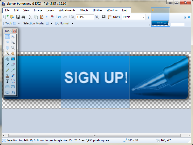
Before I copy the button states onto the canvas, I’m going to remove the text from them, preserving the pen graphic. Then I’m going to stretch them to 1000px.
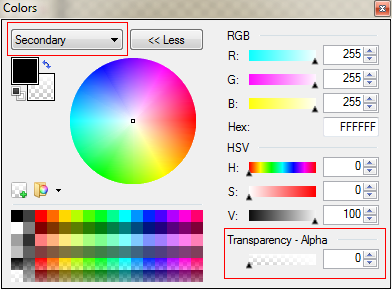
- In Paint.NET, set the background color to full transparency
- Use the selection tool to select just around the text, making sure to select the full height of the image
-
Delete the text with the Delete key
-
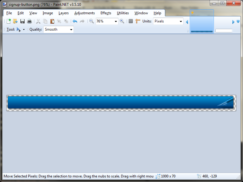
Select the entire left side of the button and cut with Ctrl-X
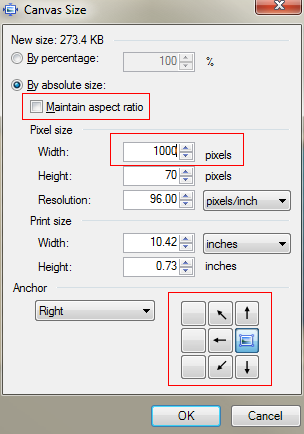
- Resize the canvas to 1000px wide (Ctrl-Shift-R), unchecking Maintain aspect ratio and keeping the current image on the right
- Ctrl-V to paste the left side of the image back in
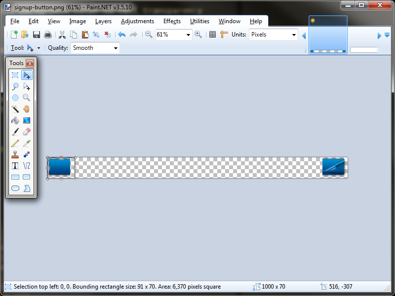
-
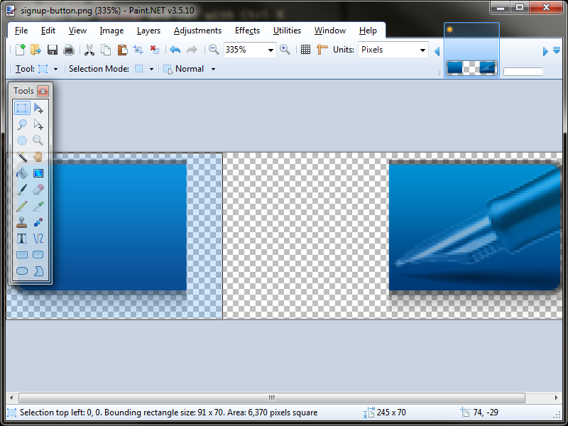
Now select a piece of the left-side button (full height) and copy/paste it, moving it to attach to the right-side button. Make sure not to overlap the pieces since the shadow will darken due to the use of alpha. Keep copying and pasting pieces until the two ends are almost connected.
-
Once they are close, select the space between them exactly (again, full-height), then use the move selection tool to place the selection over a section of button. Copy/paste and it will be the perfect size to fill the gap, leaving you with no overlaps.
Repeat with the other button state
Make the background bitmap
-
Create a new canvas with the New toolbar button
-
Select the size to be 1000px wide and 70px tall
-
Make sure the background is transparent. Delete all if you have to.
-
Select Layers > Import from file from the menus. Import the last button, in this case, the active state.
-
Resize the canvas to height 145px, keeping the current image at the bottom
-
Import again, this time choosing the normal button image
-
Save the result with a new name, in our case
signup_bg_button.png
Create the css
Here’s the tricky part. We want to borrow as much as possible from the existing css while overriding what needs to change for our new picture.
We need a more specific selector which applies to our button wherever we
need to override, while still preserving the artisteer classes.
Additionally, our selectors can’t rely on adding properties or markup to
the wrapper and spans, since those are generated automatically in
javascript. That is to say, we still want to be able to just write
<a href="#" class="art-button">Button Text</a> and have Artisteer fill
in the rest of the html structure for us.
The easiest way I’ve found to do this is to wrap the button in something
like a <span> or <p> with a made up class. We’ll use a span with
class signup.
Height and text properties
The height is set both on the wrapper as well as the button link itself, so we’ll start with:
.signup>span.art-button-wrapper {
  height: 70px;
}

.signup>span.art-button-wrapper>a.art-button,
.signup>span.art-button-wrapper>a.art-button:link,
.signup>span.art-button-wrapper>input.art-button,
.signup>span.art-button-wrapper>button.art-button {
  font-family: Arial, Helvetica, Sans-Serif;
  font-size: 36px;
  font-weight: bold;
  top: -3px;
  color: #C7DFF3 !important;
  text-transform: uppercase;
  text-shadow: 0 1px 0 #032C56;
  line-height: 70px;
  height: 70px;
  padding: 0 95px 0 25px !important;
}

.signup>span.art-button-wrapper.hover>.art-button, .signup>span.art-button-wrapper.hover>a.art-button:link {
  color: #FFFFFF !important;
}

.signup>span.art-button-wrapper.active>.art-button, .signup>span.art-button-wrapper.active>a.art-button:link {
  color: #FFFFFF !important;
}
The important things to note are that the .signup class makes these
selectors more specific than the regular Artisteer ones. We’re only
overriding the properties which we want to change however, and the rest
of the regular Artisteer ones still apply because our button matches
their selectors as well.
Our button height requires setting the line-height and height to 70px on both selectors. In addition, the padding on the left and right of the text has been increased to reflect our larger button, but more has been put on the right so that the pen graphic is not overlapped by the button text.
Additionally, the button graphic isn’t perfectly centered on the vertical axis due to the shadow and space around it, so I’ve raised the text a bit with the top attribute.
Finally, the font, color and case have been tweaked to make them “pop” a bit more. There’s also a subtle inset effect with the text-shadow, and the text is highlighted to white when hovered. This rule exists on the regular Artisteer rule already, but would otherwise be overruled by the signup text color change in the first new rule of ours.
The !important directives are there to make sure they override the
same directive on the regular Artisteer rules.
Background image
The spans need to choose the image and the right-side gap needs to be expanded for the pen graphic to stay intact. 83px should do it.
The hover state background positioning needs to be set to bottom instead of center since there is no center image now.
The active state background position is already set to match the hover state’s new position, so it can stay unchanged.
.signup>span.art-button-wrapper>span.art-button-l, .signup>span.art-button-wrapper>span.art-button-r {
  background-image: url('images/signup_bg_button.png')
}

.signup>span.art-button-wrapper>span.art-button-l {
  right: 83px;
}

.signup>span.art-button-wrapper>span.art-button-r {
  width: 83px;
}

.signup>span.art-button-wrapper.hover>span.art-button-l {
  background-position: bottom left;
}

.signup>span.art-button-wrapper.hover>span.art-button-r {
  background-position: bottom right;
}
Adding it to your site
Once you’ve got the css and background image, you can either add it back into Artisteer, where it will get included in your export output, or you can hack it directly into the css for your site. I’ll leave the site hacking to you, but here’s a bit on how to add it to Artisteer.
-
Open your design file in Artisteer
-
From the Home tab, click Options
-
Select CSS Options
-
In the text box, add our new css
This will make sure that the css gets dumped with the style.css file
every time we export from Artisteer.
The last thing is to make sure that the background bitmap also gets dumped.
Strictly speaking, it could be just as easy to put the image in your output directory manually, either by storing it there permanently or copying it in after every export. However, you don’t want to risk losing that file if you need to clean your output directory, so remember to keep it elsewhere as well if you decide to store it there permanently.
There’s two issues with getting Artisteer to dump it for you. First, it has to be visible in Artisteer, so if you use Artisteer to create content, you might not want a full-size background image just hanging out on one of your pages. I only use Artisteer for css on some of my sites, but others I use it for both, so I probably won’t store the image in Artisteer on those sites that I do both.
The second issue is that Artisteer is a bit wonky about image naming. When you import the image into a page, it will get stored by its regular name, but it will also get scaled down to the page size automatically. We need full size, but when you resize the image, it gets stored again, this time with “-2” appended to the filename.
I decided not to fight it and simply adjusted my css to include “-2” on the filename in there.
So, to save it in Artisteer, just edit any page and add an image. Select the file and it will get added to the page at a scaled size. Right-click it and select Image properties, then set the scaling at 100% and you’re good.
That’s it!
The finished article
Here’s a sample of our new button, with the old one for comparison.
Note that the css for the button on this page has been updated to use
the class art-button-old instead of art-button. This is because the
upgrade of the blog theme to Artisteer 4 required me to change the name
of the class and manually add in the old Artisteer 3 css.